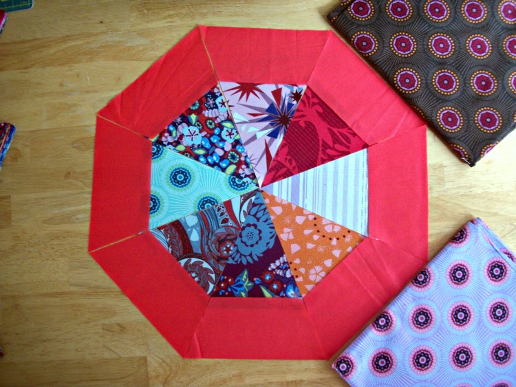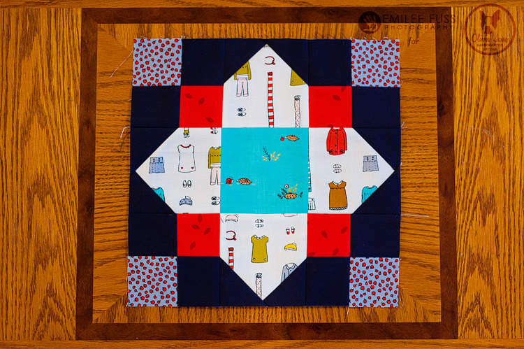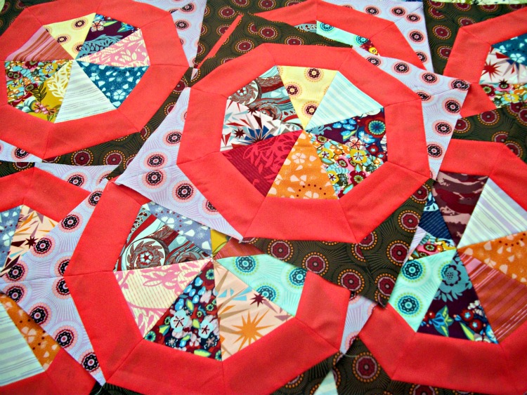
Well I need your help. Rather badly, actually. I got all of my “A” pieces cut out the other day, and I’ve been procrastinating with the “B” pieces. Why? Well I’m just not sure I like the color I chose for B. I didn’t want my Spinning Stars Quilt to be too busy, so I...
Honestly, I think the red you have pictured here looks great! If you use just solid red in all the places AMH uses that aqua solid in her quilt featured in her blog post, I think your quilt will look beautiful. (Hope my two cents makes sense!) I don’t think I would personally mix solids and prints for that section of the quilt, but it all depends on what aesthetic you’re going for (something more regular and uniform or more of a busy, “crazy quilt” feel). Best of luck with whatever you decide! Can’t wait to see your progress!
Thanks, Emily! I’m think I’m going to just keep going with the red, and when I get half of the blocks done and laid out and if I hate it, I’ll have to come up with an alternative for the other half. Several people seem rather confident that the red looks great, so I should probably stop overthinking it and just go with it. Thanks so much for giving me your opinion!
I really like the red. Alternating with prints might leave you unhappy with every other block. Do you have another coordinating solid in your stash? Maybe using two solids would help you reach the look you want. Anyway, you would need at least four with red either way, so make those and see how they look together!
I don’t have any other coordinating solids. I think if I stick with just the red, I will use darker Perle 5s for quilting to “calm it down”. Once I have half of my blocks completed I’ll lay them out and will probably ask what you think again. I guess I’m just afraid of hating it! I’ve been planning this quilt forever and it just has to be my favorite. Thanks so much for your advice!